Improving Old Graphics
Share this story
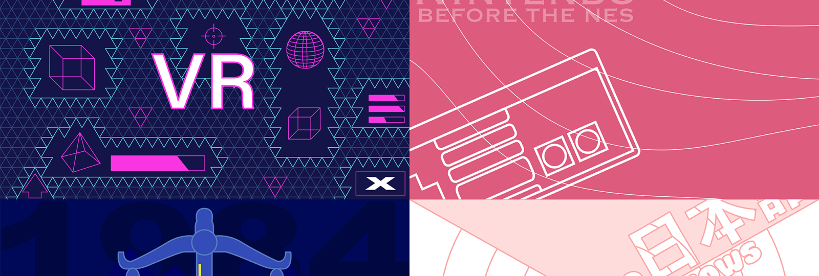
Over the past few years, I’ve made many graphics for different articles on the Waukee Arrowhead website and in the Arrowhead magazine. Whether it be ideas, techniques, or quality, I try to learn something from each graphic I make. The graphics I made back then were not perfect and the ones I make now aren’t perfect. Though in order to improve more, I must look back on what I did wrong and improve.
Virtual Reality
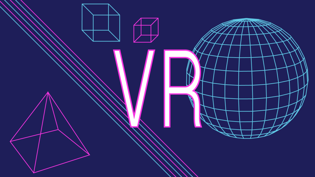

The VR graphic was the first graphic I tried giving a futuristic technology theme. Using my favorite color combination, blue and pink, I started making the graphics. Originally in an arrowhead magazine, the shapes were graphics I made for the article. I spent more time making the wireframe sphere than anything else in the finished graphic. What I failed to accomplish in the original design was to give a sense of collaboration. None of the graphics complemented each other in more than one way. In the improved piece, I decided that I would do more of throwing graphics on the screen but I wanted to help them complement each other. I did this by adding a triangle grid background. Leaving the color of the triangles subtle until they opened to create a gap around one of the graphics. Adding bars and graphs as if the piece was a HUD (Heads up display) from a video game.
Nintendo Graphic
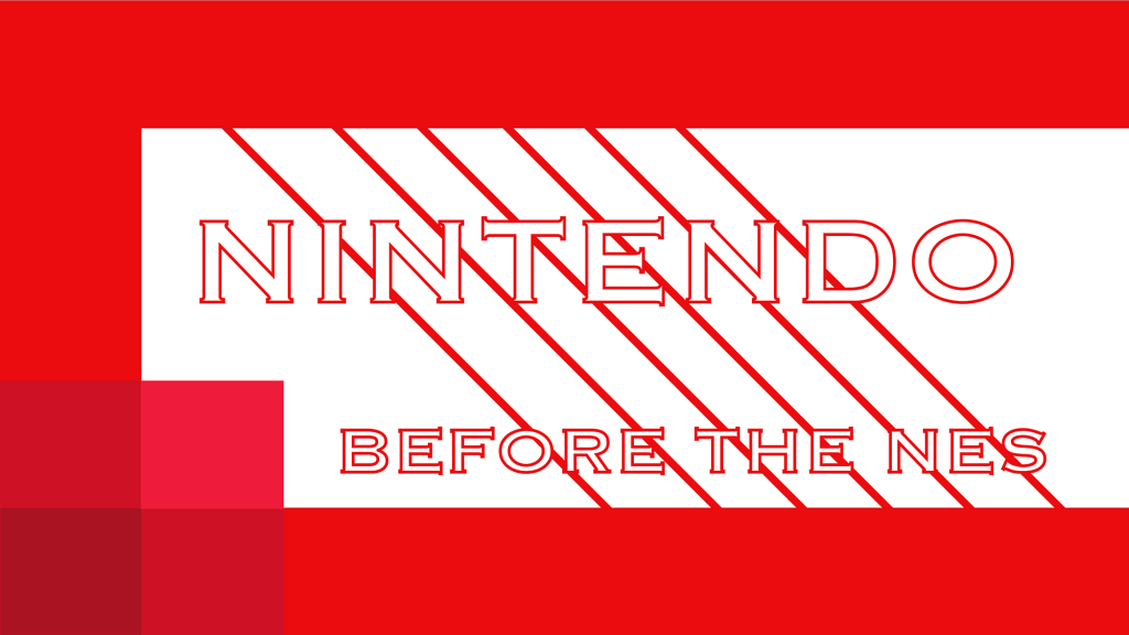
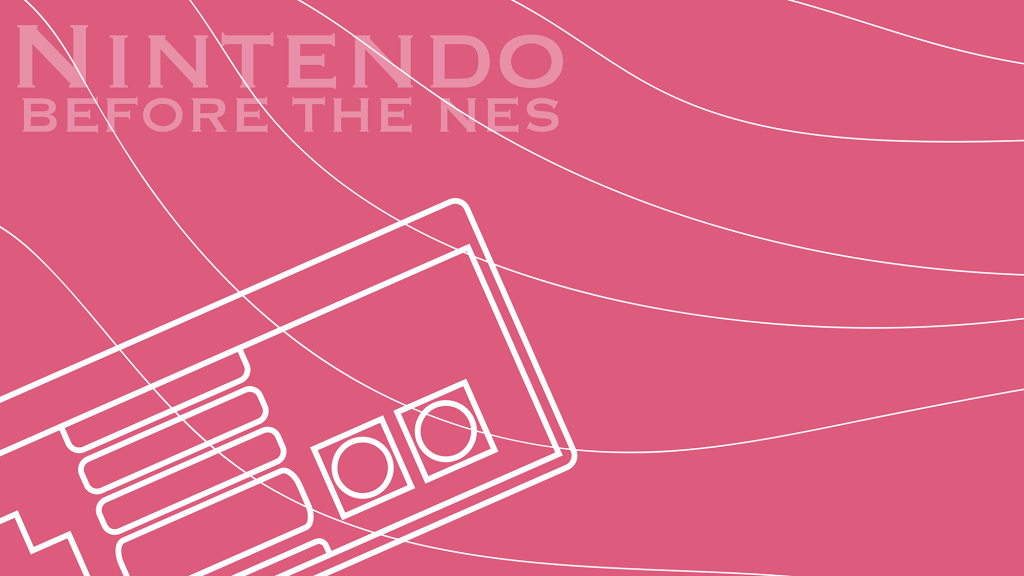
For the Nintendo Graphic, I wanted to use the color palette of the original Nintendo logo and a modern feel to it. I failed to make the colors clash with each other so the words could be easily read by the viewer. For the improved graphic, I tried to give it a more calm feel and have the words fade out. I wanted the classic NES (Nintendo Entertainment System) controller to be a prominent object in the image but I also didn’t want to make it the center of attention. The NES isn’t the focus of the article, but Nintendo as a corporate entity is. I think I succeeded in expressing that in my improved graphic.
Epic Games Sues Apple
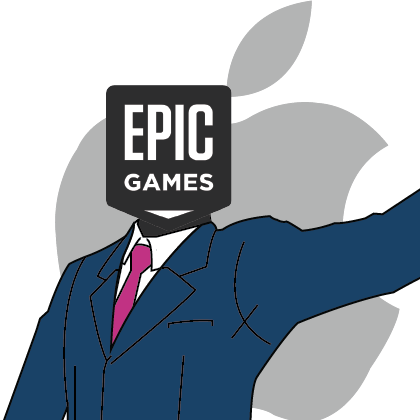
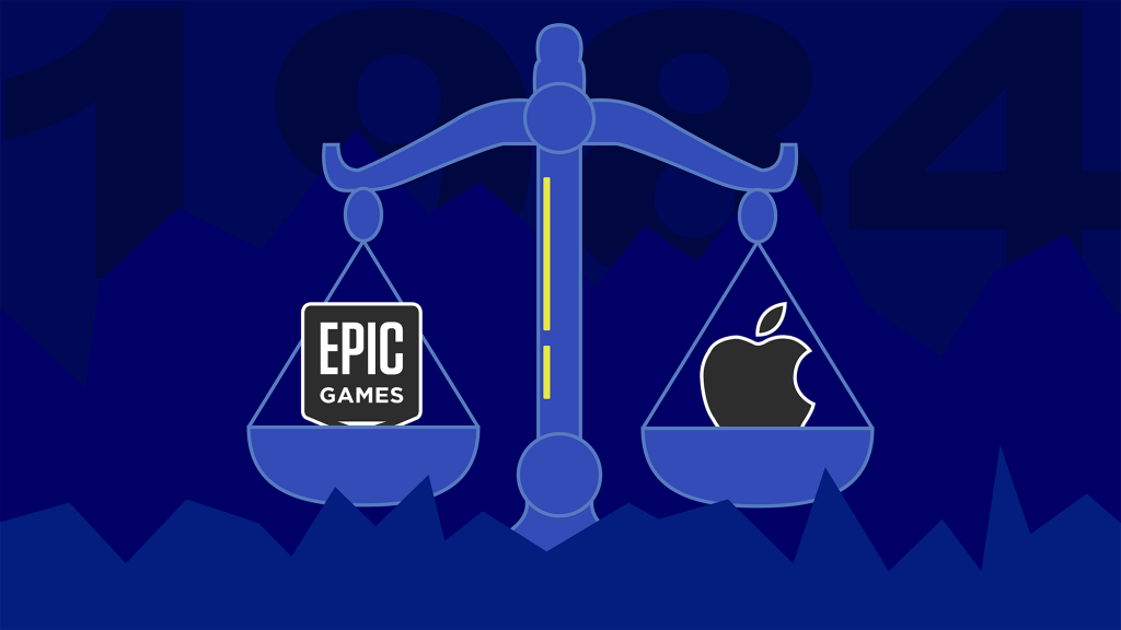
With the iconic pose and suit of Phoenix Wright, a lawyer from “Phoenix Wright: Ace Attorney”, Epic Games is taking Apple to court. I made this graphic before I learned what was needed for a web graphic. As Phoenix Wright is the protagonist of the games, it puts Epic games in a better light compared to Apple is made to look like a looming corporate giant, when they are both corporate powerhouses. I wanted to display a sense of balance between the two better in the improved graphic. The old graphic failed to have a present color scheme but it also used its space effectively to produce a narrative, albeit a slightly biased one. The new graphic has a dark blue color scheme to give a cold feeling when looking at the two corporate giants being weighed. With this improved piece, I wanted to try and experiment with depth and make it seem as if the scale was surrounded by jaggedy terrain. Hidden behind everything is “1984” which is the signature year Apple and Epic Games used to push their narratives at their respective times.
Japanese Game Shows
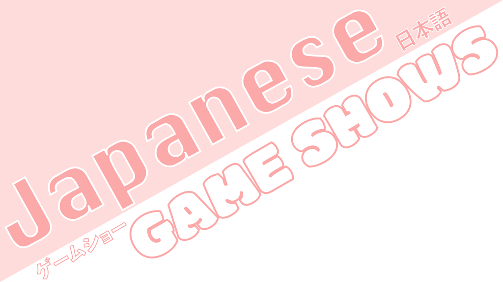
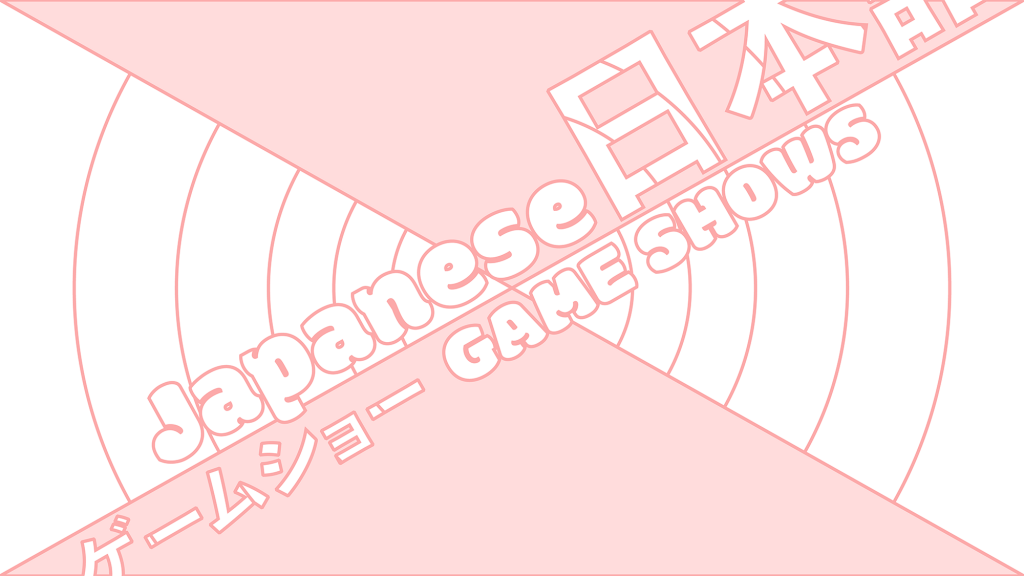
The graphic for my article about Japanese Game Shows is one of my favorites. It used its space effectively in a way and used a fun font similar to what fonts are used in Japan to advertise products in a fun enthusiastic way. The words ‘Japanese Gameshow’ are translated into Japanese and are a bit hard to see in the original. The original failed to keep the fonts the same as I originally thought there should be a separate tone between the words “Japanese” and “Game Shows” and looking back now I wanted the two words to work together. I loved the tone I went for in the original so I wanted to build more off of that in the improvement. I tried to make the Japanese translations larger and more apparent with the bubble font making up both the entire title. Finishing it off with the same color scheme and some circles in the middle reminiscent of the “Looney Tunes” end screen.
